Data and analytics are your most powerful tools for making effective business decisions and bringing accountability to your operations. Zoho CRM provides a range of clear, easy-to-read dashboards – from simple charts to anomaly detectors – that enable you to harness that power in order to make the right decisions and streamline your business.
Let’s take a closer look at what dashboards are and how they work:
What are dashboards?
Dashboards are a collection of different metrics that are critical for the operation of a business. They are generally displayed in the form of a visualisation. For instance, lead analytics dashboards will have all the charts and graphs related to leads within the CRM. Essentially, dashboards give you the information you want to see in the way you want to see it. Think of them like the instrument panel in your car!
Why do we use dashboards?
There’s no denying that the human eye enjoys seeing things that have beauty and purpose – from beautiful paintings to exotic cars. It’s no different with data visualisations. We naturally crave good-looking things – and with dashboards, we can see data in a way that is easy on the eye. Moreover, we tend to take in the information more easily due to the reduced cognitive load. How amazing is that!
Do I need dashboards?
Data is the backbone of most businesses nowadays. From demographic to sales data, every bit is important information that businesses can leverage to improve their process and maximise efficiency.
If your business deals with a bunch of data, analytics and visualisations will be your friends. Depending on your business model, visualisations can give you a useful overview of how the business is operating at a glance – no ugly, incomprehensible data that you need to piece together yourself!
Data visualisation helps businesses to thrive, as it aids executives to understand what the patterns and relationships in the data are telling them about their business, and use that understanding to make well-informed decisions.
Types of visualisations
Charts
Charts are the simplest visualisations. Below are the three commonly used ones:
Column charts
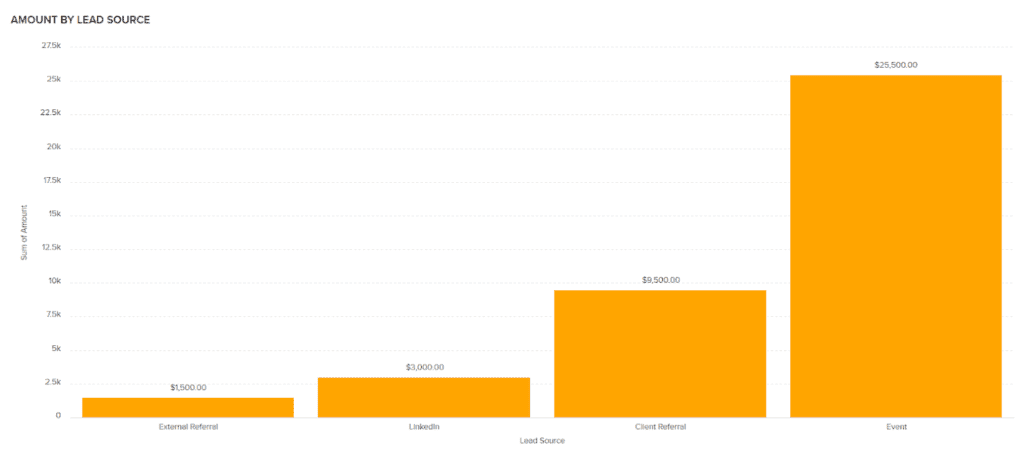
These are great for information that falls into discrete groups or categories. They are generally used when the categories have no particular order, as in the example below:
Pie charts
These are the most fun to look at. The advantage of this kind of chart is that it allows you to see the data as a whole – for example, total revenue from different sources or organisations.
Area charts
This is a pretty sophisticated chart. It essentially compares the data on the x-axis (bottom line) to the potential maximum (represented by a line that is filled up). An instance of this would be a line representing a sales target. The graph shows how much someone has contributed to that target. This is great for tracking employee data to see how much work people have been putting in, providing a ‘part-of-a-whole’ perspective.
KPIs
Many businesses use KPIs (key performance indicators) to track whether they are hitting their targets or not.
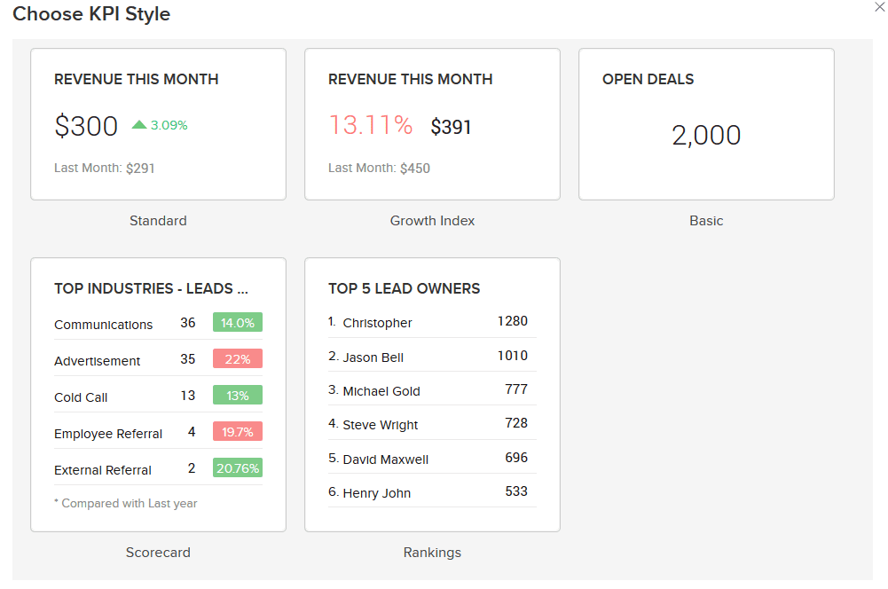
In Zoho CRM, users are spoiled for choice as to how their KPIs are displayed. The figure below illustrates several different KPI styles, each catering for a different type of targets. All these figures are automatically pushed in from the data input into the CRM, making this an easy and effortless way for users to see if their business is meeting their objectives. In some styles they can also compare this month’s figures with last month’s figures – a perfect tool for businesses wanting to smash their targets and excel.
Comparators
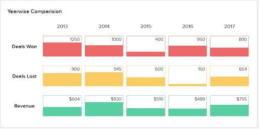
Comparators are another component of Zoho CRM’s analytical capabilities. They provide an overview of the business’s performance by comparison, and are especially effective for showing how the business has performed in different areas at different times. Clean and easy to read and understand, comparators are ideal for almost every user.
Anomaly detectors
This is a huge one when it comes to analytics. The purpose of data analytics is to find trends and patterns in the data, but sometimes there is irregular, or ‘dirty’, data. How important is it to find this dirty data, you ask? Very important. Dirty data is inaccurate, outdated or inconsistent date and has a profound impact on a business, to the point where it can skew the data so badly that it leads businesses to make the wrong choices.
Zoho CRM is able to detect this through its anomaly detector tool, as pictured below:
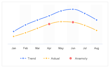
Using past sales data as a trend, the graph can figure out spikes and dips in your actual/current data, which is helpful for identifying errors in the data.
Target meters
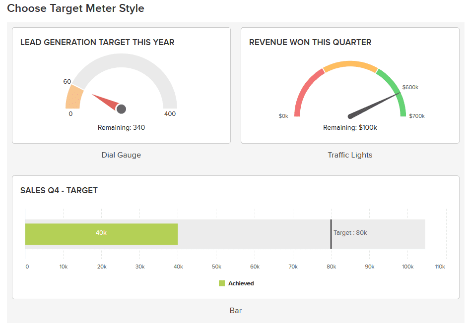
Much like KPIs, target meters are visualisations designed to show business how close they are to hitting a target. They are often colourful and provide very useful information.
Funnels
In a perfect world, 100 percent of customers would follow through with a deal from start to finish. This is unfortunately not always the case, with customer numbers often dropping off as the deal progresses.
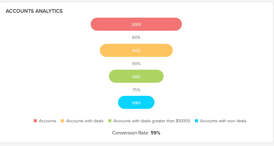
Funnels are a vital visualisation for any business because they show exactly where in the process – from first encounter to closing out the deal – customers are dropping off.
How can businesses capitalise on funnel analysis? By seeing exactly where the opportunities are being lost, they can invest more effort in that stage of the process.
Zoho CRM’s funnels provide easy-to-read visualisations of these critical metrics throughout the process, as illustrated below:
Personalise your dashboards
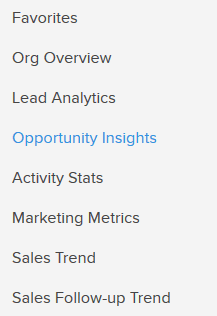
Zoho CRM gives users the ability to arrange all these visualisations in their own personalised dashboard – that’s right, it’s not limited to only one dashboard. For instance, a business may want views such as organisation, customer or lead analytics. This is great as it keeps the visualisations relevant to each other. Below are some examples of how a business could label their dashboards:
Zoho CRM – all the analytical tools you need
Data and analytics go hand-in-hand with each other and are an extremely powerful tool for decision-making in businesses. With Zoho CRM, businesses can effortlessly produce visualisations that aid them in decision-making and bring accountability to all aspects of operations.
From simple charts to anomaly detectors, Zoho CRM has all the analytical tools required to streamline your business, no matter the size. Start now and turn a good business into a great one.
